| Informational Websites | ChronoMaddox -- the legacy of Chuck Maddox | OnTheDash -- vintage Heuer website | Zowie -- Omega information |
| Discussion Forums | ChronoMaddox Forum | Heuer Forum | Omega Forum |
| Counterfeit Watchers | ChronoTools Forum | ChronoTrader Forum |
|
|
The largest independent, non-commercial, consumer-oriented resource on the Internet for owners, collectors and enthusiasts of fine wristwatches. Online since 1998. | |||||||
|
||||||||
|
||||||||
 |
Vintage Heuer Discussion Forum
The place for discussing 1930-1985 Heuer wristwatches, chronographs and dash-mounted timepieces. Online since May 2003. | ||||||
| |||||||
| |||||||
: The previous discussion we had over one of these is on:
:
: http://www.chronocentric.com/forums/heuer/index.cgi?noframes;read=28111
: Looking back at that watch now, and specifically at the Carrera
: text and Heuer shield, it really does say redial to me. I was
: trying to say as much at the time without being blunt, but maybe
: it got lost in translation.
: The watch you link to is a different watch, looking at the Heuer
: shield and Carrera text. So, we have now seen two of these. For
: me, it doesn't bode particularly well that the two examples have
: notably different Heuer shields and Carrera text from each
: other, whereas the Carreras we know have pretty stable text
: throughout its life from 1964 to ~1971. I also find it odd that
: both have the same box with the confusing image that appears to
: verify that 3641s had Carrera dials, and in both cases the box
: is very crisp.
: Let's look at the history of the 3641 in a bit more detail.
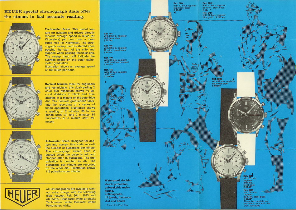
: In original form, it predates the Carrera (as you can tell from the
: lower reference number than the Carrera 45's 3647) and was
: effectively an economy alternative to the steel-cased 404:
:
: 
: This catalogue dates from 1962, which could well be the year in
: which it is also introduced - it doesn't appear in earlier
: catalogues, unlike the 404 and 2444. At this point it used
: pretty much the same dial furniture as the 2444 precursor to the
: Carrera 12 2447, which itself had had layout revisions that
: year. It continued in this form for some time until, at some
: later date I haven't been able to put my finger on during
: research but seems to be after the Carrera's launch in 1964, the
: 3641 adopts Carrera hands and dial typography. As did Jarl, I
: only managed to find pictured examples of 3641s in this
: configuration in catalogues dating from around 1967:
: 
: It's important to note that, throughout the 3641's lifetime, it
: retained a number of characteristics that distinguish it from
: the Carrera as we know it:
: - the case was chrome-plated base metal, never steel (this is
: common to most of Heuer's economy models and is largely what
: makes it possible for them to be economy in the first place),
: - the 3641 never has the 1/5 second internal bezel that was one of
: the innovations Heuer was proclaiming in its new Carrera
: advertising - instead the scale is painted directly on the dial
: edge,
: - the case shape is different, with rounded lugs as opposed to the
: Carrera's iconic angular ones, and
: - the markers in this late version, though plain steel like an
: early Carrera's, are less detailed without the bevelled ends.
: Now the Carrera 12 Dato doesn't have the internal bezel either (it
: doesn't have room on its dial!) nor does it have exactly the
: Carrera case. In fact, it too predates the Carrera proper but in
: this example, it would appear that Heuer saw the benefit in
: associating its triple calendar watch with the very successful
: Carrera and hence the triple calendar became a Carrera too
: (without much effort other than amending literature, as the
: Carrera name of course doesn't actually appear anywhere on the
: 12 Dato).
: But what would be the benefit of associating the economy 3641 with
: the Carrera? Isn't it more likely that it would cannabalise
: sales of the more profitable 3647 if both were marked Carrera on
: the dial? After all, the movements are the same between the two
: watches.
: The 3641 is a nice watch in its own right, as this example of
: Jarl's shows:
:
: 
: but it only makes sense if Heuer keeps it discrete from the
: Carrera, as otherwise the overlap becomes too significant. Some
: people will always want to save money and opt for the economy
: version but if both were Carreras it would be commercially
: ill-advised at best and at worst the Carrera 45 3647 would be
: dead in the water. I'm not saying every Heuer decision of the
: period was commercially logical, but this one seems to me to be
: a classic no-brainer.
: That photo of Jarl's watch demonstrates something quite clearly -
: the Heuer text within the shield always has a gap between it and
: the edge of the shield, and that gap is consistent between each
: letter and the shield. Now, study any mixture of Heuer
: chronographs from the period and you'll see that they struggle
: to get the white text on a black dial quite as fine as the black
: text on a silver/white/standard dial but the general point holds
: true that there is a consistent gap between Heuer and the
: shield.
: Looking at the watch in question, the text seems a bit too big for
: the shield for me and I'm not entirely sure from the relatively
: small photos whether the gap above the Es is the same as it is
: below them, or that the gap below each E is the same. If the
: Heuer shield has in fact been redone, would it not have been
: possible to add the Carrera text at the same time? Not blaming
: the seller, I am sure quite a few people would be tempted by
: this as an unusual Carrera but to me it is a redial.
: Caveat emptor is the usual saying, but I think for these there also
: has to be some onus on the sellers to show that the watch is
: genuine too. I have seen very few 3641s but many hundreds of
: Carreras, backed by documentary evidence from brochures, sales
: lists, adverts etc. This, along with the simple sales logic of
: keeping the two lines separate, makes me doubt that any 3641 was
: marked Carrera ex-factory and I would be looking for very strong
: proof to make me change my mind.
| Chronocentric and zOwie site design and contents (c) Copyright 1998-2005, Derek Ziglar; Copyright 2005-2008, Jeffrey M. Stein. All rights reserved. Use of this web site constitutes acceptance of the terms of use. | CONTACT | TERMS OF USE | TRANSLATE |