| Informational Websites | ChronoMaddox -- the legacy of Chuck Maddox | OnTheDash -- vintage Heuer website | Zowie -- Omega information |
| Discussion Forums | ChronoMaddox Forum | Heuer Forum | Omega Forum |
| Counterfeit Watchers | ChronoTools Forum | ChronoTrader Forum |
|
|
The largest independent, non-commercial, consumer-oriented resource on the Internet for owners, collectors and enthusiasts of fine wristwatches. Online since 1998. | |||||||
|
||||||||
|
||||||||
Vintage Heuer Discussion Forum
The place for discussing 1930-1985 Heuer wristwatches, chronographs and dash-mounted timepieces. Online since May 2003. | |||||||
| |||||||
| |||||||
Great observations, as always . . . I am still at the office, but will study the black Montreal dial tonight, to see exactly what is there and what is not, in terms of the detail.
Without studying any watches, in the metal or from the C-drive, I had one quick reaction to your observation about the quality of the Montreal dials. It's simply that Heuer seemed to have some inconsistency in terms of the quality of its dials (or perhaps even in their specifications).
I have had nearly-identical 2447S Carreras -- from the same general time period and with the same quality of "preservation" -- side by side, and the finishes on the dials have been very different, one with flat paint and the other with much more grain / satin in the finish. My conclusion: that with different lots of dials, and perhaps with different dial producers, the quality and detail had some significant variation. I doubt that this was an attempt at "style" -- like a kid going from a fine-point pen to a crayon, to do a different style of drawing -- but I imagine that this was just a fact of life, in the production of these dials / watches.
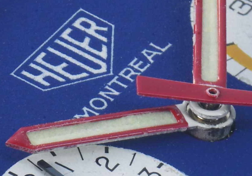
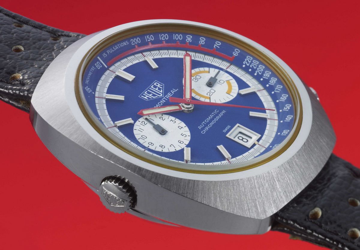
For everyone's enjoyment, here are a couple of photos from our very best studio photographer, Bruce Mackie, showing a blue Montreal dial . . . his original image was over 5,500 pixels wide. I have cropped the "Heuer" from his original image (but not done any re-sizing) and also show an image of the entire watch, re-sized to 1,200 pixels (which may result in distortion).
Let me know what you think of these, and use the link below to see more of Bruces awesome photos.
Jeff
++++++++++++++++++++++++++++++++++++++++++++++++++++++++++++++
: Nice photos Jeff, but I have to confess what really struck me with
: these close ups was what a crappy job Heuer did with the
: "Heuer" text within the shield on these black
: Montreals.
: Not wishing to demean your specific watch, I went away and checked
: some photos (and Arno's book) and this lack of detail and
: somewhat clumsy finishing seems endemic to the black (and to a
: lesser extent, the blue) Montreals. At the time of the first
: generation Carrera, we should all be fairly used to the black
: paint on silver dials having much more detail and finesse in
: terms of serifs etc than the white paint on black dials, but I
: thought they'd had this sorted by the time the Montreals went on
: sale.
: Check this '74-on Carrera for instance, black dial but with a good
: amount of detail in the white paint:
:
: 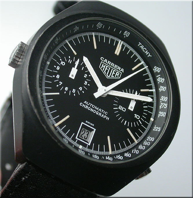
: And I would have thought a barrel-cased Carrera would have made a
: good template for a Montreal, but somewhere down the line the
: standards seemed to have slipped a bit. Sure the Montreal is a
: big watch, but is the shield scaled up that much? Don't have a
: Montreal to compare to a Carrera but the shield doesn't
: look that much bigger in photos.
| Chronocentric and zOwie site design and contents (c) Copyright 1998-2005, Derek Ziglar; Copyright 2005-2008, Jeffrey M. Stein. All rights reserved. Use of this web site constitutes acceptance of the terms of use. | CONTACT | TERMS OF USE | TRANSLATE |