| Informational Websites | ChronoMaddox -- the legacy of Chuck Maddox | OnTheDash -- vintage Heuer website | Zowie -- Omega information |
| Discussion Forums | ChronoMaddox Forum | Heuer Forum | Omega Forum |
| Counterfeit Watchers | ChronoTools Forum | ChronoTrader Forum |
|
|
The largest independent, non-commercial, consumer-oriented resource on the Internet for owners, collectors and enthusiasts of fine wristwatches. Online since 1998. | |||||||
|
||||||||
|
||||||||
Vintage Heuer Discussion Forum
The place for discussing 1930-1985 Heuer wristwatches, chronographs and dash-mounted timepieces. Online since May 2003. | |||||||
| |||||||
| |||||||
This is something you see various trends in through the different 70s Heuers. As happens all too often, it's quite hard to find a unified theory for when, where and why it's used.
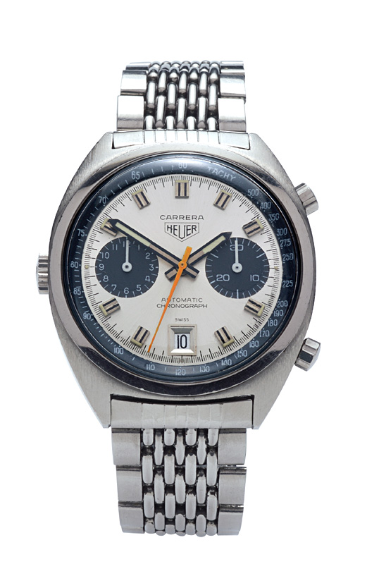
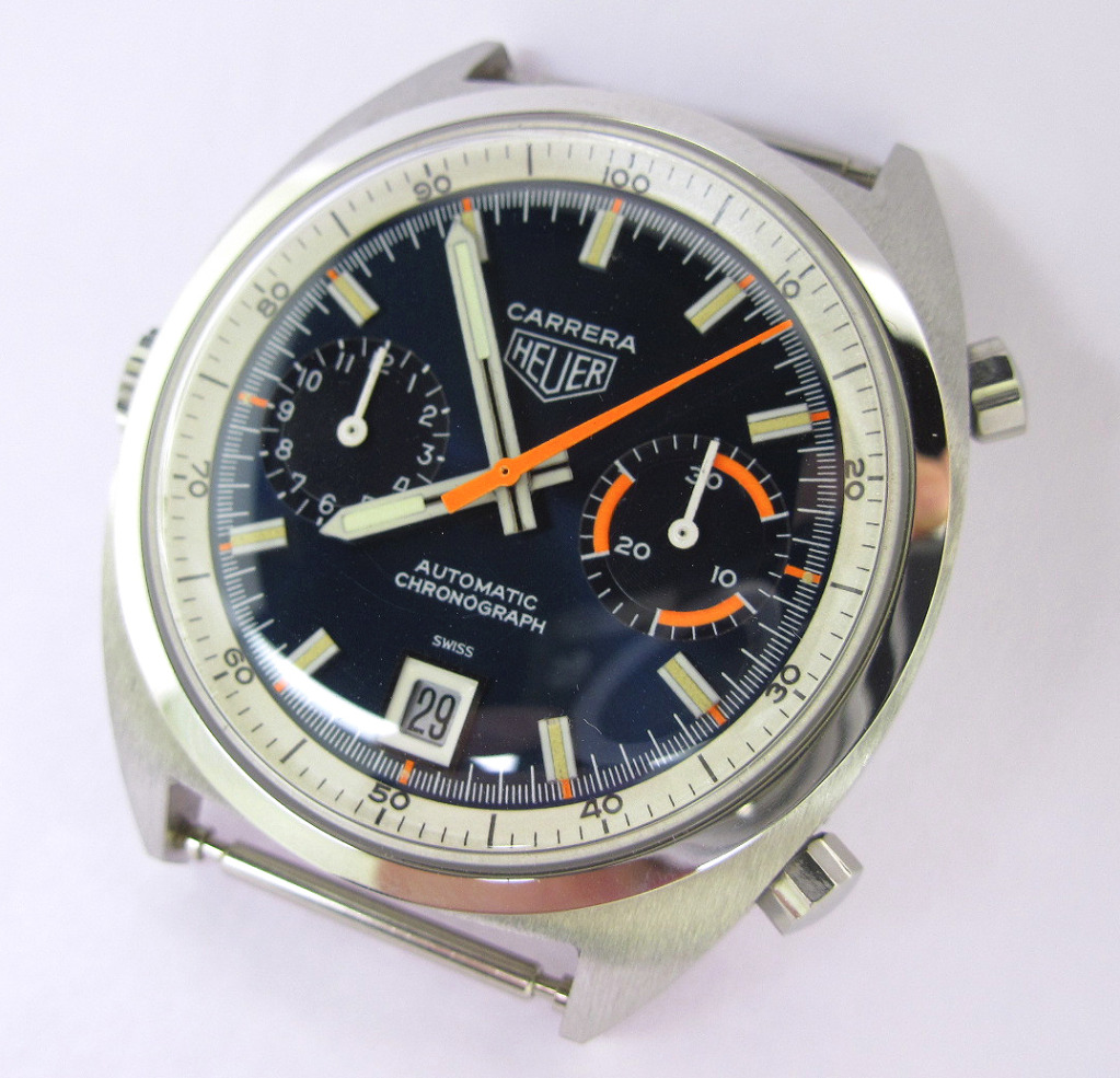
Where a watch existed before the Chronomatic launch in 1969 (i.e. the Autavia and Carrera), they definitely start out with what I would call the "classic" font, that we see on the majority of the 1960s watches:
The Monaco, without having those predecessors to inform its design, starts off with a variant of what I'll call the "modern" font for our purposes (inverted commas as for me it has echoes in the fonts used in the 30s and 40s, but as a label it will do in the absence of anything better).
All well and good so far.
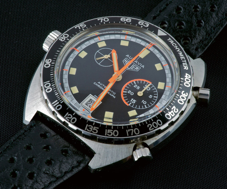
Now, let's pick a watch that launches after 1969. Calculator in 1971, that will do nicely.
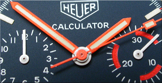
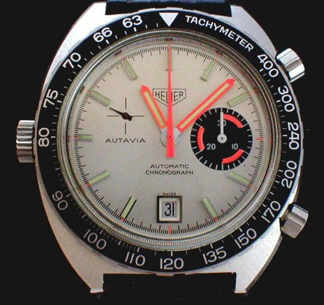
Modern font. Great, so our theory is holding together. And the Cal 15 Carreras, coming along just after the Calculator? Classic font, so that fits too. So the Cal 15 Autavias will be classic font too, right?
Ah. No. Well, that messes that part of the theory up :s
Oh well, at least we know that the new watches launching without a direct antecedent in the '60s will have the modern font, right Mr Montreal?
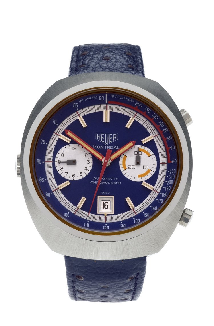
Oh. Poo. So the Carrera's the only one we can rely on to stick to our initial theor.... hmmm? What's that?
Humph. Right. So there's no consistency at all then.
And later on in the decade, we have a third design, used on Cortinas, Veronas, Jaramas, a couple of Carreras...
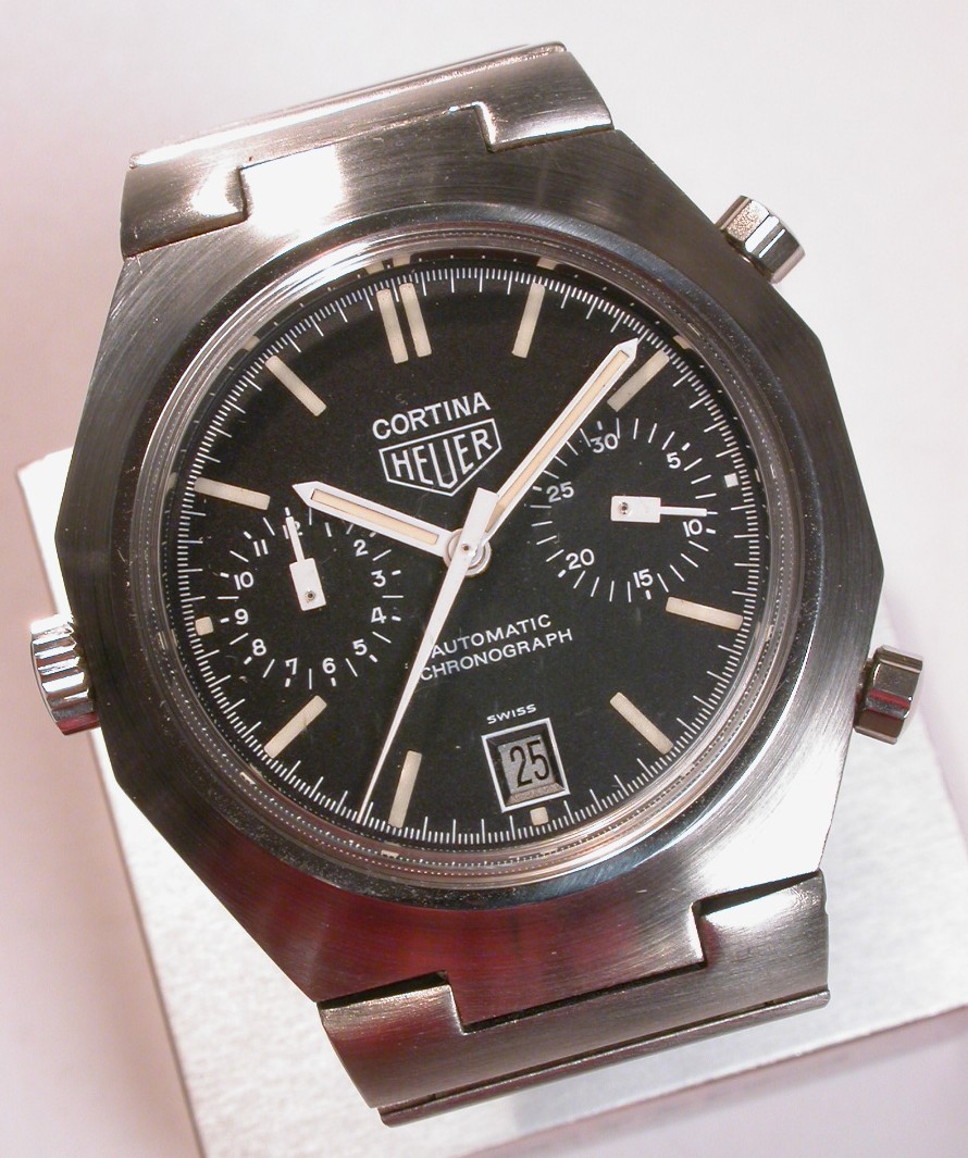
At least some of those have the decency to be the only type to be used on a model!
But for the two long-lived models, we have to take on board that all 3 types were used. All 3 Mark? But the last style was only used on some late Carrera 110.253s, right, not on the Autavia? Well...
Though it could be argued that only shares a layout with the version used on the Carrera et al, the typography is significantly different.
| Chronocentric and zOwie site design and contents (c) Copyright 1998-2005, Derek Ziglar; Copyright 2005-2008, Jeffrey M. Stein. All rights reserved. Use of this web site constitutes acceptance of the terms of use. | CONTACT | TERMS OF USE | TRANSLATE |