| Informational Websites | ChronoMaddox -- the legacy of Chuck Maddox | OnTheDash -- vintage Heuer website | Zowie -- Omega information |
| Discussion Forums | ChronoMaddox Forum | Heuer Forum | Omega Forum |
| Counterfeit Watchers | ChronoTools Forum | ChronoTrader Forum |
|
|
The largest independent, non-commercial, consumer-oriented resource on the Internet for owners, collectors and enthusiasts of fine wristwatches. Online since 1998. | |||||||
|
||||||||
|
||||||||
 |
Vintage Heuer Discussion Forum
The place for discussing 1930-1985 Heuer wristwatches, chronographs and dash-mounted timepieces. Online since May 2003. | ||||||
| |||||||
| |||||||
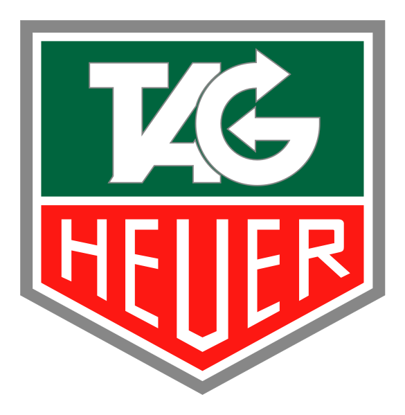
Just curious really.. but we are all familiar with the regular shield logo where the T, A & G letters are stylised and semi-integrated, but on social media content, the T, A & G are separated, as regular letters. I thought this might be only for use on Social Media, but it has popped up elsewhere too.
In either case, I find it rather strange that a well known and established logo has been 'played around'. This sort of thing is uncommon when global brands are concerned. As someone who has worked with some global brands, usually there is a 3 inch thick document that tells you in no uncertain terms on how NOT to mess around with the logo.
Does anyone know what the official line from TAG Heuer is about this?
For those who are wondering what I'm on about, below are the logos..
Original...

Different logo...

Stewart
Heuerville
| Chronocentric and zOwie site design and contents (c) Copyright 1998-2005, Derek Ziglar; Copyright 2005-2008, Jeffrey M. Stein. All rights reserved. Use of this web site constitutes acceptance of the terms of use. | CONTACT | TERMS OF USE | TRANSLATE |