| Informational Websites | ChronoMaddox -- the legacy of Chuck Maddox | OnTheDash -- vintage Heuer website | Zowie -- Omega information |
| Discussion Forums | ChronoMaddox Forum | Heuer Forum | Omega Forum |
| Counterfeit Watchers | ChronoTools Forum | ChronoTrader Forum |
|
|
The largest independent, non-commercial, consumer-oriented resource on the Internet for owners, collectors and enthusiasts of fine wristwatches. Online since 1998. | |||||||
|
||||||||
|
||||||||
Vintage Heuer Discussion Forum
The place for discussing 1930-1985 Heuer wristwatches, chronographs and dash-mounted timepieces. Online since May 2003. | |||||||
| |||||||
| |||||||
A question though - in the Cortina section, you make reference to an Omega version and refer us to the watch in the top-right corner. Hard to tell at that resolution, but what I'm seeing there is a watch with Lemania branding over the day/date windows and some sort of logo that I can't make out at 12 o'clock - am I missing something?
I also think it's a bit of a stretch to say the Carrera 510s are "basically the same watch as the Cortina". Yes, the cases have some rough similarities but then you could probably find a watch with a similar case for 95% of watches out there, barring the exotic and the ridiculous (yes, I'm looking at you Bell & Ross). When you get down to the details, though, there are more differences than similarities - the Carrera case is narrower, also making the radius of the curve notably shallower than in the Cortina. The Cortina has bevels at each edge (top, bottom and side), whereas the Carrera has the cut-outs for the lugs and very plain sides:
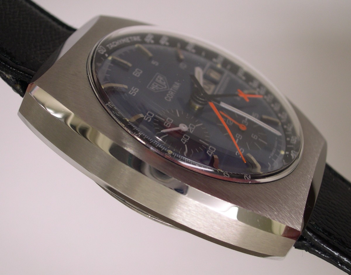
/Reference_510.523/13Carr510f3.JPG)
The top surface of the case has a much more pronounced curve on the Carrera than the relatively flat Cortina too. So when you look closely, it comes down to them sharing the same domed crystal :) I'd say they are no more similar than an early Carrera and a Speedmaster, for instance.
That's not to rule it out. You might think Heuer, even under different management, might want to protect the image of one of their flagships but later, under different management again, they proved willing to play free and easy with the Carrera with the 7750 models. You'd think they'd at least want some input to the design of such an icon as a Carrera, but it's hard to design cues from other Carreras in the 510s (internal bezel, 1/5 second markings then it starts to run a bit dry).
I get the feeling there's more to the story with the Carrera than some of the others. Perhaps it's a collaborative design, with Heuer retaining the design rights, hence this design not appearing on a plethora of other watches unlike some of the Lemania-powered Heuers.
You have to wonder how much of the "design" of a watch was actually handed over to the specialist part suppliers. One of the first things that struck me when I started collecting was how similar the typography of the numbers in the registers is between pretty much all 60s chronographs. Rolex, Omega, Heuer, Breitling, if you were just to see a single register in isolation, without pointers, you'd be unable to place it. It makes me wonder if someone at Singer, or one of the other dial producers, or all of them acting as a cartel, nailed the difficulty of printing numbers on an angled, and sometimes also ridged, surface and just went back to the watch houses and told them those were the numbers they were going to get. I find that a lot easier to accept than the watch houses all getting together and agreeing on a standard font.
| Chronocentric and zOwie site design and contents (c) Copyright 1998-2005, Derek Ziglar; Copyright 2005-2008, Jeffrey M. Stein. All rights reserved. Use of this web site constitutes acceptance of the terms of use. | CONTACT | TERMS OF USE | TRANSLATE |