| Informational Websites | ChronoMaddox -- the legacy of Chuck Maddox | OnTheDash -- vintage Heuer website | Zowie -- Omega information |
| Discussion Forums | ChronoMaddox Forum | Heuer Forum | Omega Forum |
| Counterfeit Watchers | ChronoTools Forum | ChronoTrader Forum |
|
|
The largest independent, non-commercial, consumer-oriented resource on the Internet for owners, collectors and enthusiasts of fine wristwatches. Online since 1998. | |||||||
|
||||||||
|
||||||||
Vintage Heuer Discussion Forum
The place for discussing 1930-1985 Heuer wristwatches, chronographs and dash-mounted timepieces. Online since May 2003. | |||||||
| |||||||
| |||||||
Hmmmm.
Yes, the Heuer 12 has a big logo as well, but it's much better executed than the one on the watch under discussion:

Photo is one Stewart posted when he was first looking for info on the watch.
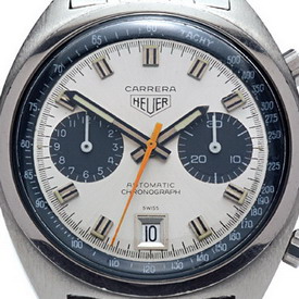
Study the eBay photo closely and compare it to the watch Ron is talking about and you'll notice that the execution of the shield is pretty different between those two too. Those sort of inconsistencies are always a concern. That's not to say they never happen - check the relationship of the size of the Carrera text to the Heuer shield on the 1153 and 110.253 G below:
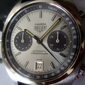
Both are correct in this case, the 110.253 G and 110.255 feature narrower Carrera text than the other second generation Carreras. Confusingly, the 110.253 B that was contemporary with these two features the usual, wider text but once you realise it reuses the dial from a barrel Carrera, the reason for that becomes clear.
But those are rare exceptions. Normally, you would look for the dial printing to be pretty much identical for multiple examples of the same dial, of course, and normally also for different colour versions of the same dial. Here, we have 2 blue dials with different versions of the large shield and the fumé version has an entirely different shield again. The dial manufacturer would typically use the same printing stamp for different colour dials, particularly if they use the same colour as they do here so this large variation is more cause for concern. And haven't we seen sterile versions of these dials? If so, that could be the clincher.
| Chronocentric and zOwie site design and contents (c) Copyright 1998-2005, Derek Ziglar; Copyright 2005-2008, Jeffrey M. Stein. All rights reserved. Use of this web site constitutes acceptance of the terms of use. | CONTACT | TERMS OF USE | TRANSLATE |