| Informational Websites | ChronoMaddox -- the legacy of Chuck Maddox | OnTheDash -- vintage Heuer website | Zowie -- Omega information |
| Discussion Forums | ChronoMaddox Forum | Heuer Forum | Omega Forum |
| Counterfeit Watchers | ChronoTools Forum | ChronoTrader Forum |
|
|
The largest independent, non-commercial, consumer-oriented resource on the Internet for owners, collectors and enthusiasts of fine wristwatches. Online since 1998. | |||||||
|
||||||||
|
||||||||
 |
Vintage Heuer Discussion Forum
The place for discussing 1930-1985 Heuer wristwatches, chronographs and dash-mounted timepieces. Online since May 2003. | ||||||
| |||||||
| |||||||
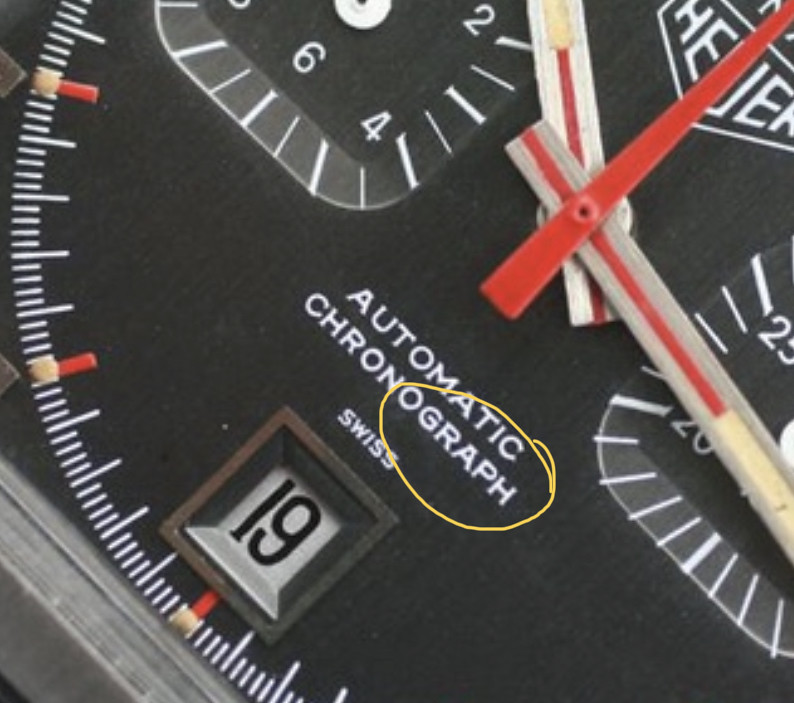
Interesting to see this dramatic difference between the "fat" RA and the "pointed" RA. Yes, it is easy to see, once we know what we are looking for. And when we visualize the pad printing process, we can understand how this happened . . . two different engravings (masters) yield these different fonts on the dials.
Thanks for the detective work on these. Now, all we need to do is determine the serial numbers that related to each of the dial styles!! That can be for the next decade.
Jeff
+++++++++++++++++++++++++++++++++++
: You are correct Michwr - there is an early Monaco dial style and a
: late one! It is true for both blue and grey dials.
: For me it is not to U-RON or not to U-RON, but rather the case of
: the Fat RA and the Normal RA....
: To check your theory, I looked at the blue transitional Monaco
: dials. I used the OntheDash Chronograph Galleries, which are a
: fantastic reference resource. I have taken blown up versions of
: these photos to emphasize the point.
: If we look at the Blue Transitional style, which we know was
: earlier than the “normal” 1133B blue dial, you can clearly
: see the different font on the dial. I think the line-up of the U
: and O is tricky to see (you need a head on shot ideally), but
: you can really see a weird “fat” RA in the word
: “CHRONOGRAPH”. In particular the A has a flat top rather
: than a pointed top:
:
: 
: You can see this font in all the blue Transitional dial Monaco’s
: - here is another photo with a different watch (also from the
: gallery):
:
: 
: It’s really easy to tell an early blue dial from a late, as the
: really early ones for the Transitional have a metallic finish.
: But you can also see this change in font, as the later matte
: blue dials have a “normal” RA with a pointed A:
:
: 
: But what is new that Michwr noticed is that you can also
: distinguish early and late grey metallic dials with sunken
: subdials! We already knew that the black “flat” subdials
: versions of the 1133G are later dials, but we didn’t know
: there were two varieties of the early grey sunken subdial
: version of the dial.
: Here is the early grey sunken subdial version of the dial with the
: characteristic “fat” RA and the flat top A:
:
: 
: Then you can see the dial change to the later font with the
: “normal” RA and pointed A, with the same change in font seen
: in the move from shiny transitional to flat blue in the 1133B.
: Here is a later grey sunken subdials version of the dial:
:
: 
: The sunken subdial 1133G I have seen was with the later style of
: dial (pointed A) and with a 16xxxx serial.
: Hope it is useful for people
: Shaun
: PS: My dream has been to find a “transitional” 1133G with the
: rectangular hands, now we know it would need to have a “fat
: RA” dial to be correct! And then the grail of grails, a grey
: Chronomatic....that really would be a find.
| Chronocentric and zOwie site design and contents (c) Copyright 1998-2005, Derek Ziglar; Copyright 2005-2008, Jeffrey M. Stein. All rights reserved. Use of this web site constitutes acceptance of the terms of use. | CONTACT | TERMS OF USE | TRANSLATE |