| Informational Websites | ChronoMaddox -- the legacy of Chuck Maddox | OnTheDash -- vintage Heuer website | Zowie -- Omega information |
| Discussion Forums | ChronoMaddox Forum | Heuer Forum | Omega Forum |
| Counterfeit Watchers | ChronoTools Forum | ChronoTrader Forum |
|
|
The largest independent, non-commercial, consumer-oriented resource on the Internet for owners, collectors and enthusiasts of fine wristwatches. Online since 1998. | |||||||
|
||||||||
|
||||||||
Vintage Heuer Discussion Forum
The place for discussing 1930-1985 Heuer wristwatches, chronographs and dash-mounted timepieces. Online since May 2003. | |||||||
| |||||||
| |||||||
Ara:
Thank you for walking us through this design. It looks absolutely awesome to my eye, and now I can see some of the elements that give this one such a special look.
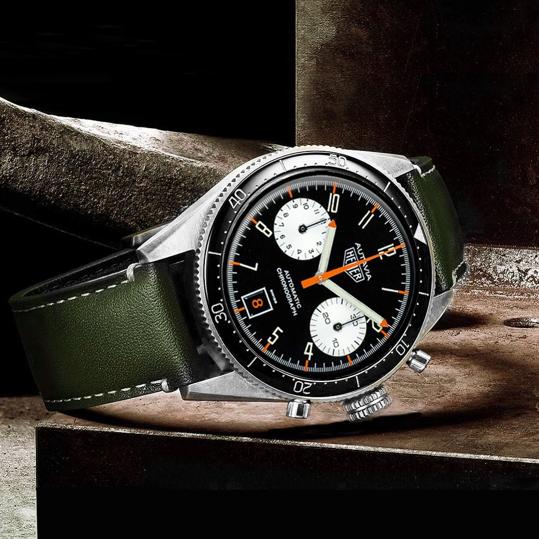
I agree that the elongated Arabics are beautiful . . . so distinctive and attractive. And of course, your case resembles the second execution Autavia screw-back case, which was the People's Choice in the "Autavia Cup", much more than the case currently being used for the Autavia re-issues.
Let's flip this image to our friends at TAG Heuer and see whether it gains any traction!!
Thanks again,
Jeff
+++++++++++++++++++++++++++++++++++
: Thanks for the post, Jeff!
: Not much of backstory but here goes: The elongated Arabic numerals
: of the Shauntavia are just so cool to me. So, I got inspired on
: New Years Eve and thought the slick black bezel of the 2020
: Autavia would blend nicely with that dial. The font is just so
: unique that there’s no surprise it’s such a Heuer favorite.
: What’s also super cool is the longer colored marker sticks that
: extend all the way to the numerals vs shorter red ones on a
: Viceroy for example. To me this is reminiscent of 60s Heuer —
: e.g. the “All Lume” Autavia 2446H lume markers and also the
: Carrera 3647’s marker/dial simplicity — and I love that
: design detail of the 60s Heuer designs.
: Back to the font: I think it has a strong “wow, WHAT. IS.
: THAT?” quality and it would be great to see on a re-issue one
: day. In its own way, the Skipper dials have a similar “this is
: different” whimsicality to their dial design. Which is what
: makes Heuer so fun and interesting I think. I hope the watch
: designers had as much fun making these classics ~50 years ago as
: we all do appreciating them.
: - Ara
: :
| Chronocentric and zOwie site design and contents (c) Copyright 1998-2005, Derek Ziglar; Copyright 2005-2008, Jeffrey M. Stein. All rights reserved. Use of this web site constitutes acceptance of the terms of use. | CONTACT | TERMS OF USE | TRANSLATE |